Preceding Logo

The rebranding of Made in Carcere was a rather tricky endeavour. Besides any ethical factors involved, this was due to the fact that the brand and its identifying elements contained design errors that had characterized it over time and that had become components of its identity.
Owing to this, for the design of the new identity elements I started from scratch, from the heart of Made in Carcere: handmade products.
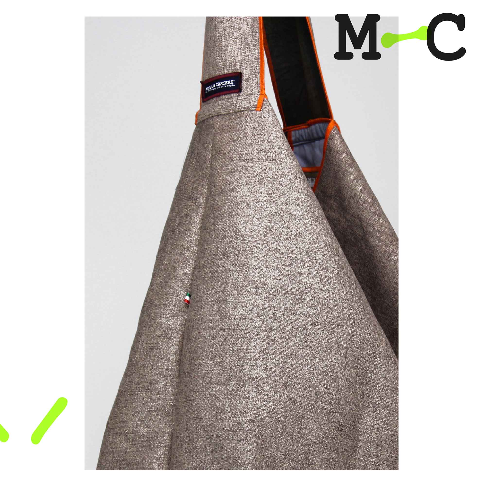
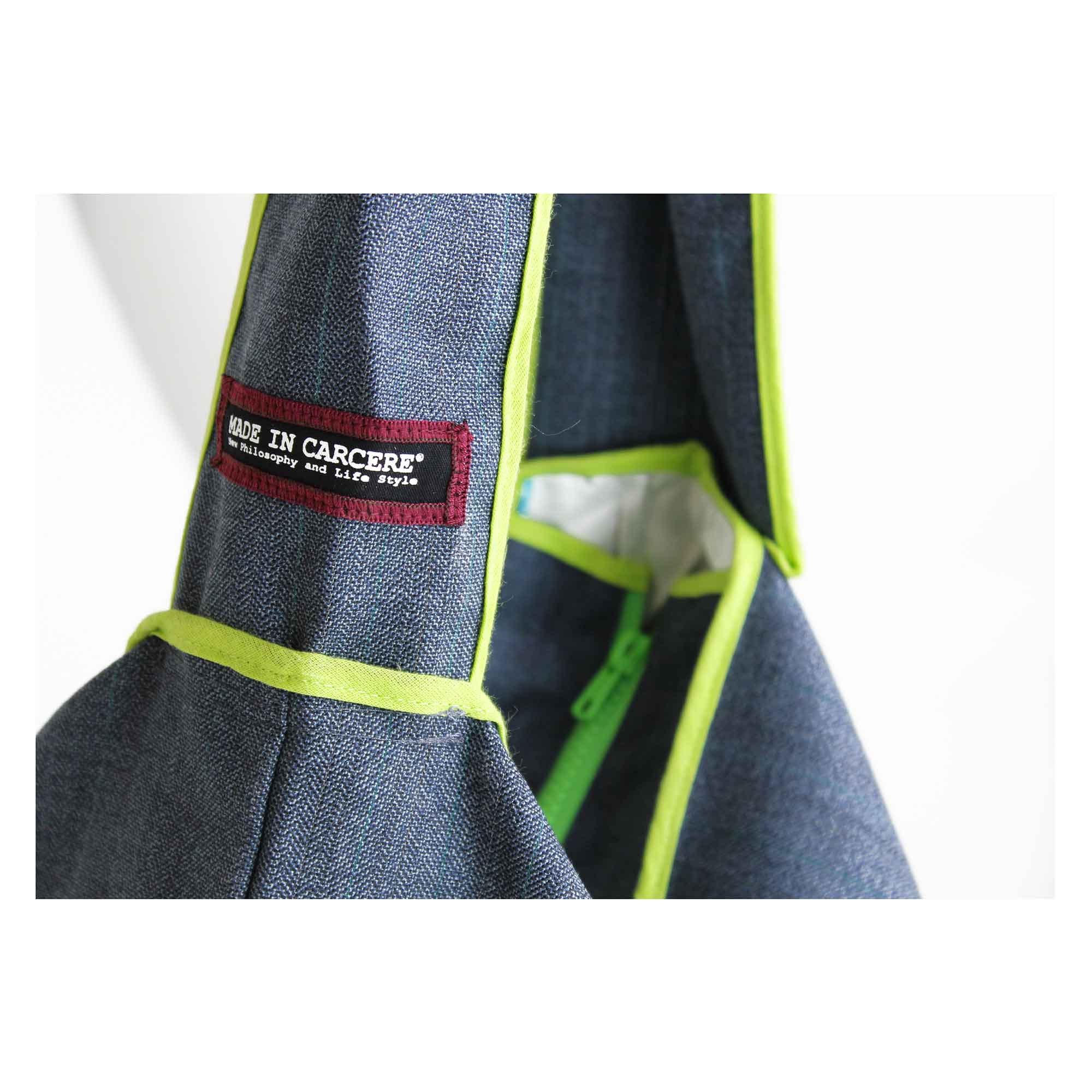
The identifying elements are in the manufacturing style, that is the visible stitching, often in fluorescent colours, and the unlined garment processing.


I therefore symbolised the seams by transforming them into a series of bonds that exorcise the condition of the inmates and at the same time connect them to the outside world.


The new logo, while incorporating features of the previous one such as the font, resolved some of the weighting issues that conflicted with the printing techniques used. At the same time, it includes a pictograph used in small applications and especially on social networks. The graphic elements give further character to all digital and printed communication.

The definition of the new image took shape on social networks with the introduction of a new stylistic language, closer to the field of fashion than to the social sector to which the brand belongs.
The aim of this choice was to present the brand on the market in a more attractive way, cleaner and closer to the essential communication of the target audience.
Single-colour images, strong graphic references and total visibility of the brand and the official hashtag are the only references required.


“The Made in Carcere brand was created in 2007 thanks to Luciana Delle Donne, founder of Officina Creativa, a non-profit social cooperative. Products are manufactured by prisoners, who are offered a training course with the aim of reintegrating definitively into the working and civil society.”
_Luciana Delle Donne / Founder


