VILLANI MIGLIETTA
Contemporary and eclectic Wine brand

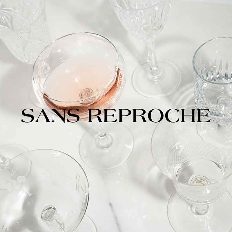
The Villani Miglietta family has existed since the XII century. They were awarded the Sans Reproche recognition by Charles of Anjou, a symbol which is still present in the family heraldry.
Camillo Villani Miglietta, the present-day family descendant, still upholds their distinctive characteristics of nobility of soul, elegance, and confidence in one's means and has taken these values along with his family’s centuries-old tradition in wine and oil to create this new brand.
My challenge was to include these values in a contemporary brand that must be competitive in a market, that of wine, which is in constant transformation and extremely sensitive to cultural trends.
Working in a team together with the entrepreneur and Marco Mascellani, the oenologist in charge of production, we built the product based on the positioning that the Villani Miglietta brand is to have on the market. Every step in the company’s processes, from the flavour to the colour of the wine, from the label to the launch campaign, were conditioned by the market positioning objectives.
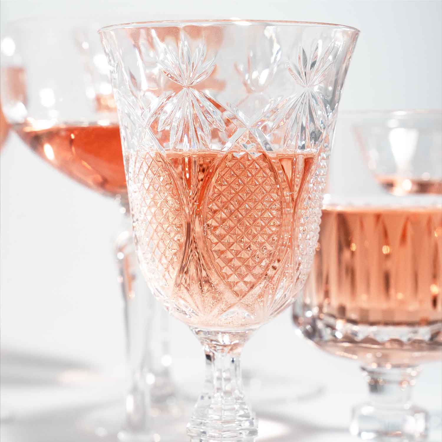
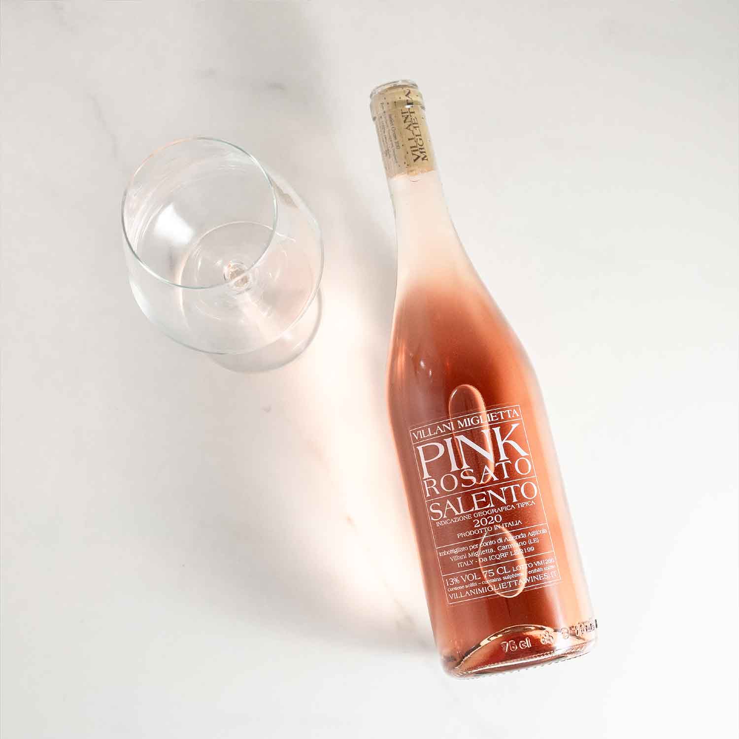
The line includes the creation of only 4 wines: Red, Pink, White, Black.
The choice of the names follows the brand philosophy, oriented towards elegance, perhaps with a pinch of arrogance and obvious internationality.
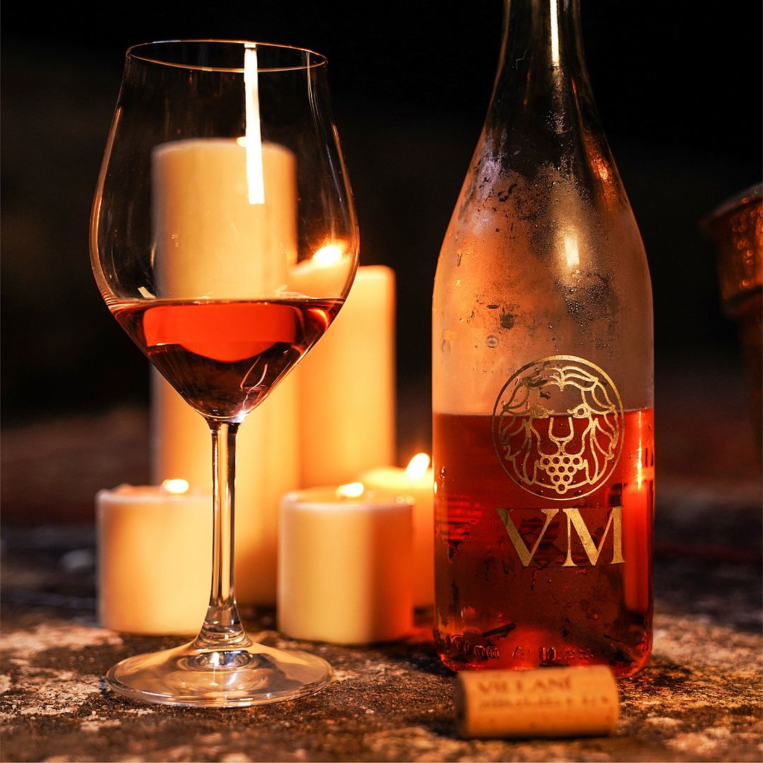
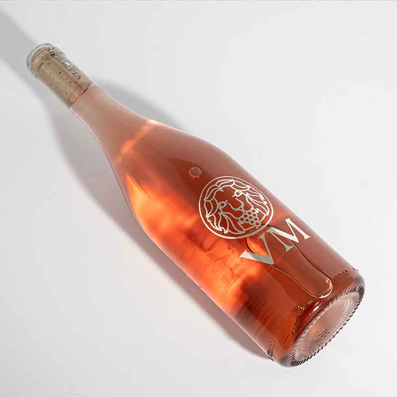
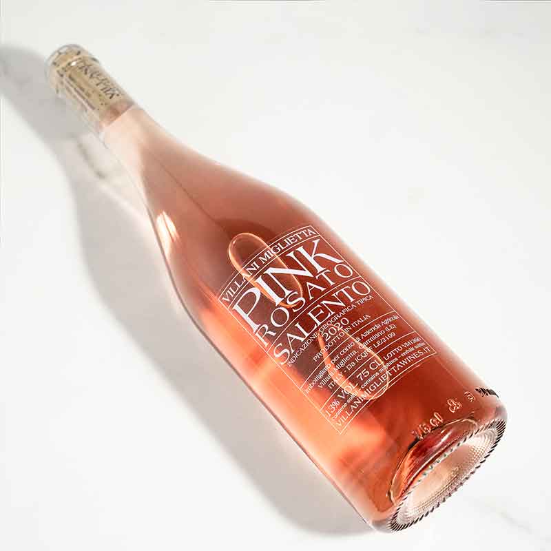
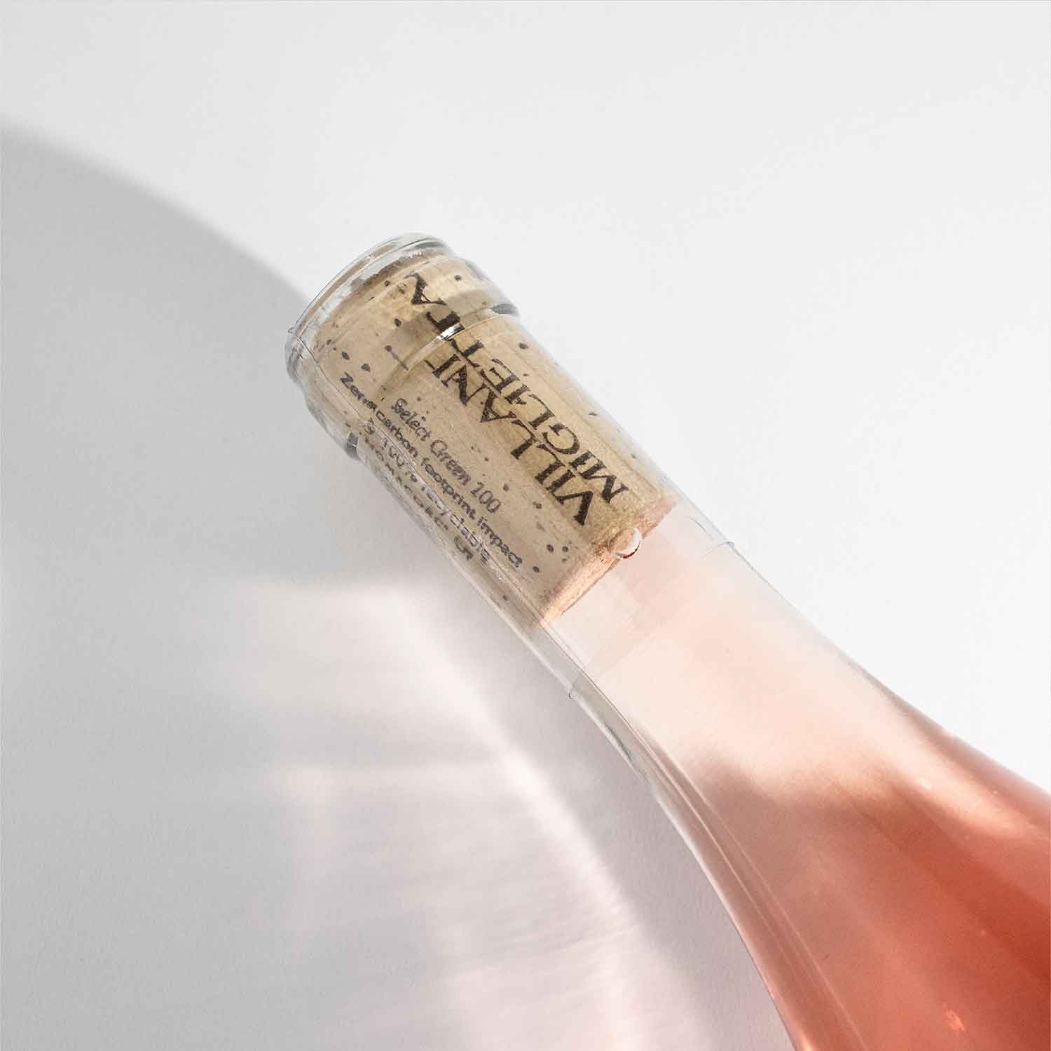
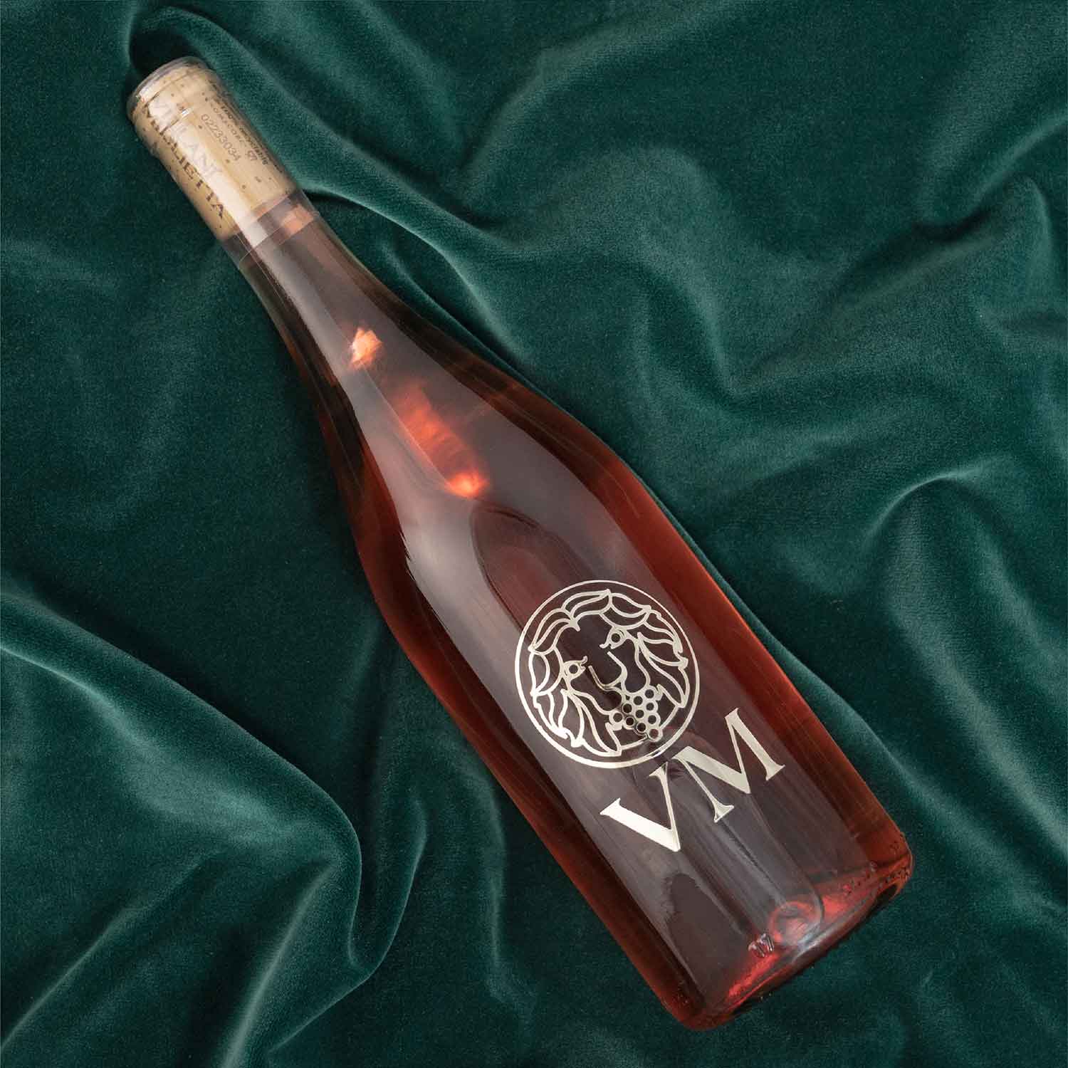
The choice of the bottle also follows these guidelines, and the label was designed to be as transparent as possible. Moreover, with a design game, I made the front and the back logically interchangeable, aesthetically ennobling the back label, increasing the intrinsic value of the product. The bottles seem to come from the private cellar of a French nobleman, from a careful selection that aims at exclusivity and craftsmanship. The entire graphic line of the brand is clean, essential, concise, foregoing any unnecessary frills.
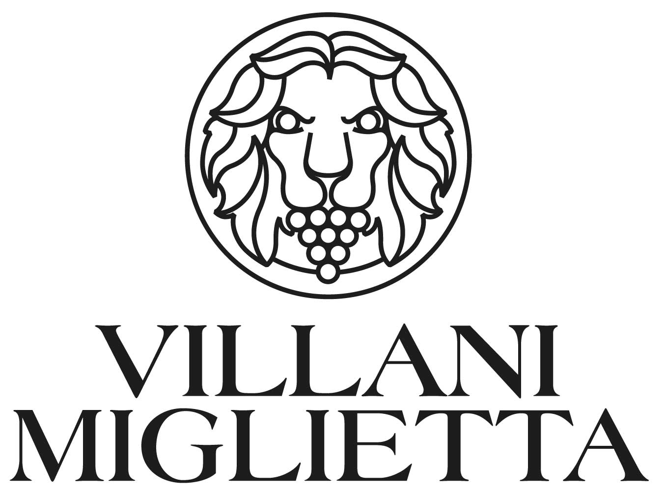
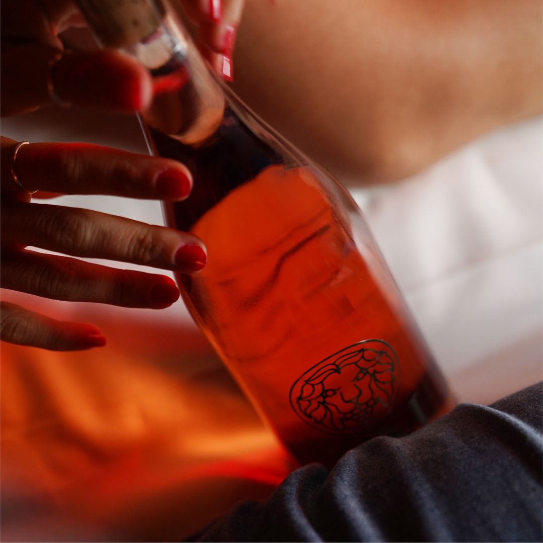
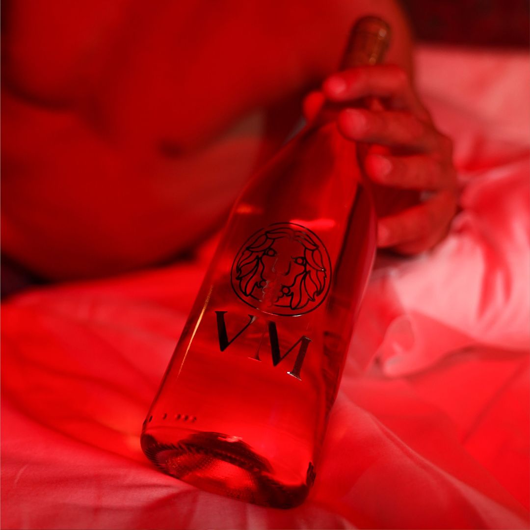
The logo presents the face of a lion with human hair, grapes in the mouth as a wish for wealth and prosperity, and the shape of a glass "gestaltically" hidden in the nose. The choice of the identifying font for the brand fell on Americana, which was designed by Richard Isbell and Whedon Davis in 1965.
I chose this font because although it is very close to the trends of the moment, it also has an extremely greater quality and depth of meaning, as well as giving persistence and historicity to the brand.
Its elegance in the curves and its solidity make the words lapidary, almost like verdicts. This is an element that supports the arrogance and strength that the brand is to have.

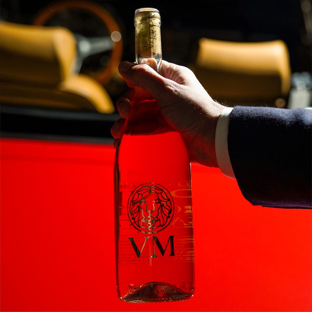
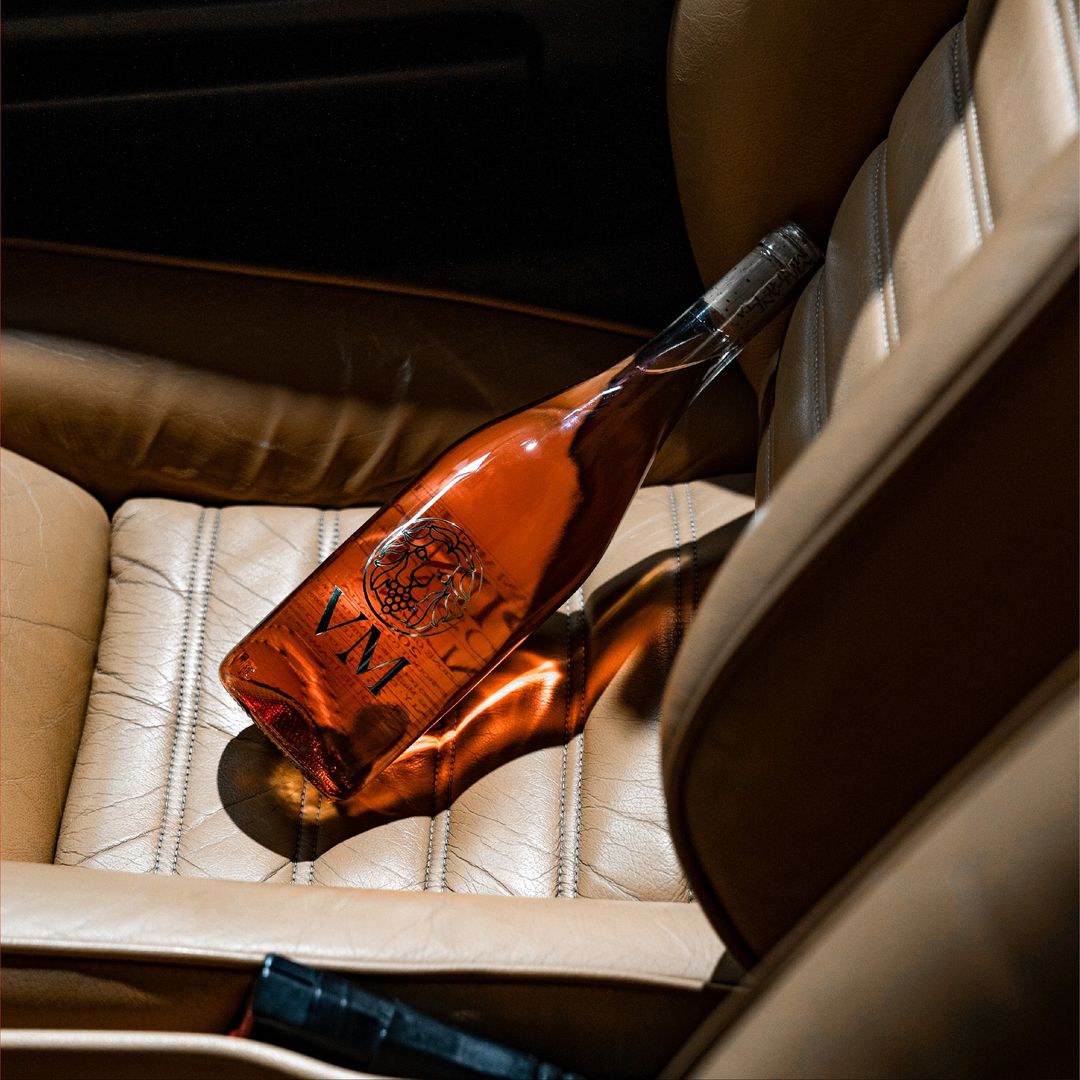
The launch campaign, which was accompanied by the construction of the distribution network with careful positioning in catering and clubbing, saw the construction of the brand's imagery through the creation of an extreme identity narrative built around a man who personifies the brand with his passions, ambitions, and convictions.
Pink was the first product to be released while awaiting the completion of the family. It became sold out by the summer, and the brand receives constant recognition from both the more competent public and the wider end users.


Visualizza questo post su Instagram

Visualizza questo post su Instagram

